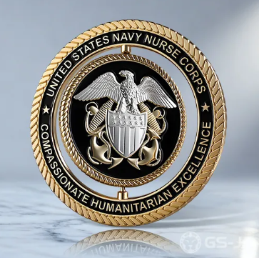
A challenge coin may fit in a pocket, but it can preserve the meaning of a shared mission, milestone, team, or event for years. The strongest designs do not try to say everything. They choose a clear idea, then use images, text, color, and metal details to make that idea easy to recognize and remember.
Before selecting a shape or finish, define the story the coin should carry. Whether you design a coin online or develop artwork with a designer, starting with a clear purpose helps prevent a meaningful keepsake from becoming a cluttered collection of unrelated details.
Why a Clear Story Matters
Challenge coins are often connected with membership, recognition, and commemoration. The challenge coin tradition is especially associated with military organizations, while coins are also used by public-safety teams, clubs, workplaces, and community groups. Regardless of who issues it, a coin works best when its purpose is obvious to the recipient.
A focused design creates an immediate impression. Someone should be able to look at the main emblem and understand whether the coin honors service, celebrates an anniversary, marks graduation, recognizes an accomplishment, or represents a shared identity. Extra elements are useful only when they reinforce that message.
See also: Regain Control of Your Life With Drug Addiction Treatment
Start With the Coin’s Purpose
Write one sentence that explains the coin before choosing the artwork. For example: “This coin recognizes five years of service by our volunteer search-and-rescue team.” That sentence becomes a practical filter for every later decision.
- Who will receive the coin?
- What achievement, event, or identity should it represent?
- Should the tone feel formal, bold, warm, humorous, or traditional?
- Will recipients carry it, display it, trade it, or receive it in a ceremony?
- What should they remember when they see it years from now?
Choose Symbols With Care
Symbols communicate quickly, particularly on a small object. A compass can suggest direction or exploration. A mountain can represent endurance. An open book may represent learning, while a local landmark can connect a coin to a place and its people. Use imagery that genuinely connects with the group rather than selecting an image simply because it looks dramatic.
One primary symbol is usually enough to lead the design. Add only two or three supporting details, such as a service area, a date, a motto, or a smaller icon. This approach gives each visual element room to be seen in raised metal or recessed areas.
Plan Both Sides as One Design
The front and reverse should feel like parts of the same story, not two separate projects. The front often carries the central emblem or image. The reverse can provide context through a short phrase, a milestone year, a location, or the organization’s name.
- Front: Place the primary symbol in the clearest central area.
- Back: Include supporting information explaining the symbol.
- Rim: Use curved outer text for a short name or motto.
- Shared details: Repeat a color, border style, or type treatment to unify both sides.
Make Every Word Easy to Read
Text is often the first feature lost when a design becomes too busy. Long mottos, multiple dates, department names, and small initials can make a coin difficult to understand at a glance. Favor short phrases and ensure the largest lettering carries the most important message.
- Can the main words be read quickly?
- Is the curved text spaced evenly around the edge?
- Would one short phrase work better than several small lines?
- Are acronyms clear to people outside the planning group?
Select Shape, Edge, and Finish
Physical choices should support the story. A round coin feels classic and versatile. A shield can complement a protective-service theme. A custom outline may work well when it reflects a badge, mascot, aircraft, building, or recognizable tool. However, an elaborate silhouette should not make the center harder to recognize.
Consider the edge and finish in the same way. Rope or reeded edges can add texture, while a plain edge keeps attention on the artwork. Antique finishes can emphasize recessed lines, and polished finishes can create a brighter contrast. Use raised detail where it helps separate the important features from the background.
Use Color Wisely
Color should establish hierarchy, not compete for attention. One or two main colors can help an emblem stand out, especially when balanced with the natural metal finish. Too many shades can obscure the design when paired with small lettering and textured surfaces.
Review the artwork in grayscale as well as color. If the central image becomes unclear in black and white, improve the shapes, spacing, and contrast before finalizing the layout.
Avoid Common Mistakes
- Using too many symbols on one side.
- Making important text too small.
- Placing crucial details too close to the outer edge.
- Using artwork that is blurry or poorly suited to metal relief.
- Combining unrelated visual styles.
- Skipping a review by someone who did not help create the design.
Follow a Simple Design Process
- Write the one-sentence purpose statement.
- Choose one main image.
- Select two or three supporting details.
- Draft the front and reverse separately.
- Remove anything that does not support the main idea.
- Review the artwork at the intended coin size.
- Check spelling, names, dates, and symbols before approval.
For example, a volunteer rescue team could place its rescue emblem on the front, then use the reverse for the team name, service area, and anniversary year. That limited set of details tells a complete story without turning the coin into a collage.
Final Thoughts
The best challenge coin designs begin with a clear purpose and remove distractions. When the words, symbols, colors, and physical details all reinforce one idea, the result is more than a small metal object. It becomes a lasting reminder of people, service, achievement, and shared experience.